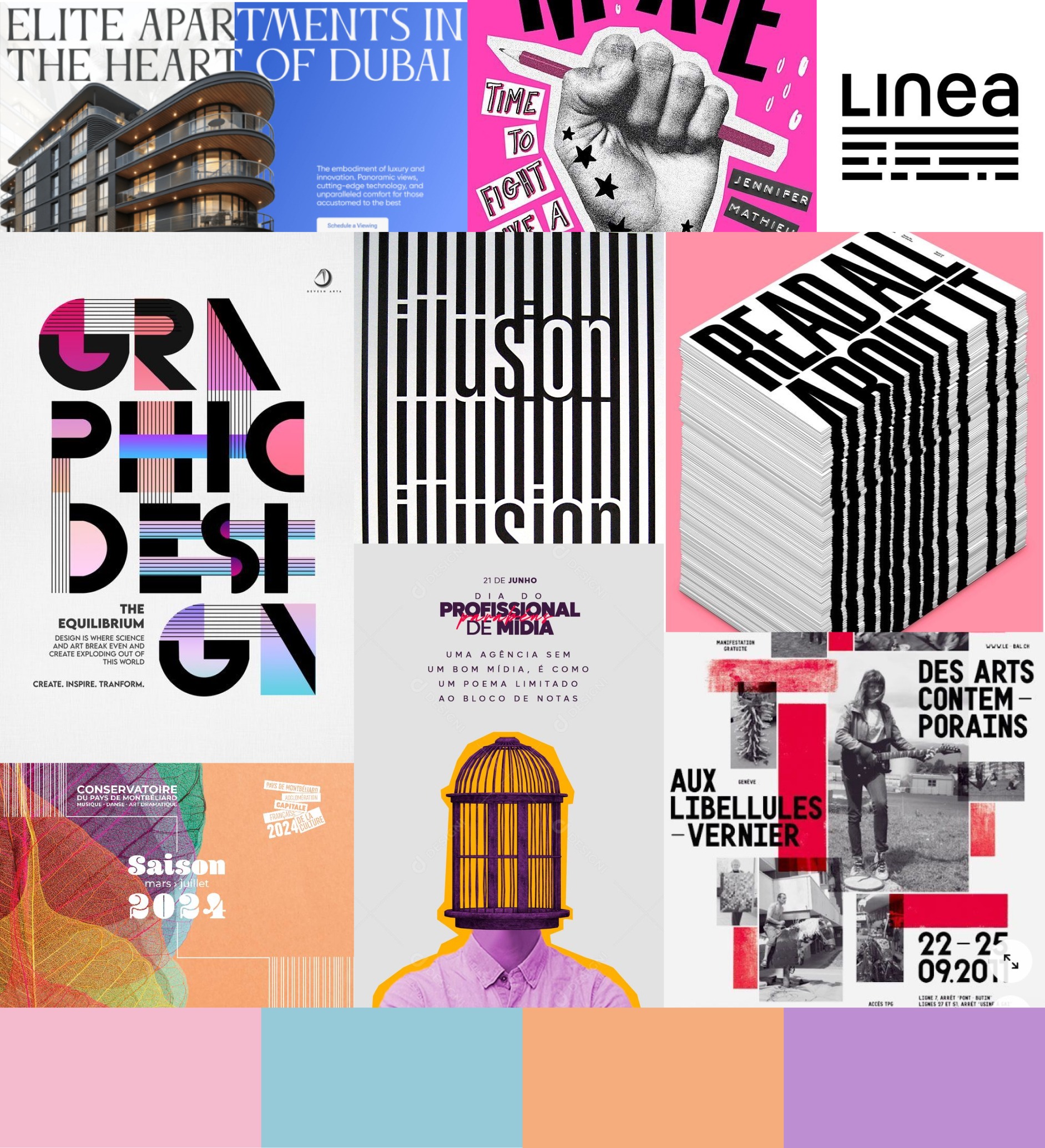
About
Projects
Tote Bag Shadows 1

Montbéliard Conservatory

Date : 2025

Subject : Redesign of the visual identity for the Conservatory of Pays de Montbéliard

University Project – Team work

Challenge :

After moving into new buildings, the Conservatory wants to review its visual identity in order to strengthen its image and presence. A redesign of the logo and a new style guide were requested, along with proposals for innovative and contemporary digital communications. Highlighting the values of the Conservatory is essential. This work had to be done in team of 3.

Logo

“A conservatory between tradition et modernity”

To take up this challenge, we chose a simple and minimalist design with abstract lines, symbolizing tradition. To bring in modernity, we decided to incorporate the iconic shape of the new Conservatory building, represented by the three distinct windows on its facade.

moodboard
existant
Before
conservatoire
After
conservatoire explication

Polymorphic

Then, we adapted the logo for the conservatory’s three disciplines: music, dance, and dramatic arts. In each case, we kept the structure of the main logo with its clean lines, modifying only the shape inside.

Each shape establishes a link between tradition, represented by the iconic symbol of the discipline, and modernity, through its simplified, refined design.

Musique

For the music, we’ve integrated a simplified sound waveform.

musique
musique explication

Danse

For the dance, we chose a more literal representation with the silhouette of 3 dancers.

danse
danse explication

Arts Dramatiques

For the dramatic arts, we took our inspiration from the symbolic mask of theater, simplifying it.

theatre
theatre explication

Model

We wanted the conservatory’s new website to be minimalist yet original, and dynamic. On the one hand, we wanted the site to convey all essential information efficiently, and on the other, we wanted it to inspire users to come to the conservatory, breaking down the “old” or “boring” image of a conservatory.

To represent this balance between tradition and modernity, we used black-and-white images framed by colored borders, creating a collage or sticker-like effect. For typography, we chose a serif font for titles to symbolize tradition and a modern sans-serif font for the rest of the text. The color palette was also chosen to reflect this duality, using vibrant, modern colors contrasted by a white background and traditional black text.

couleur
Colors
Typographie
Typography

Design System

Once the mockups were finalized, we created a design system outlining the various site components, colors, typography, logos, and their usage.

A design system defines a set of standards, principles, components, and best practices to be used in digital services and websites of an organizations such as the Montbéliard Conservatory. Used by designers and developers, a design system facilitates collaboration and guides graphic choices when creating new elements. It also ensures consistency with the brand’s visual identity. It provides tools such as color palettes, typography, icons, grids and components.

Graphic universe

To extend our visual identity, we designed a series of posters, social media posts, merchandising, and promotional items, using the main elements of the mockup, such as typography, colors, and image style.

Animation

Finally, we created an animation to showcase our work. For this one, we also worked on the duality between tradition and modernity, using dynamic and modern animations contrasted by a classical music in the background. The animation was structured in two parts, with the logo and its variations presented first, followed by the graphic universe.

First, we prepared the logos in Adobe Illustrator, separating each element we wanted to animate into different layers.

illustrator
Work on Adobe Illustrator

Then, the animation was made in Adobe After Effects. The first part was created independently of the second, to move forward in parallel. The two parts of animation were brought together at the end.

after effects
Editing on Adobe After Effects

My role

trello
Board on Trello

At the start of the project, I have setting up project management tools. I organized our Trello board and used the TeamGantt Task plugin to create a Gantt schedule. Throughout the project, I also maintained a brief progress report every half-day summarizing the progress of the work and the next steps to be done.

Later, I contributed to the creation of the logo and its variations by making several sketches and testing them in Figma. I also researched inspiration for developing the visual identity and brand guidelines.

Finally, I handled the animation creation.

I began by making several sketches on paper. Once the animation concept was finalized, I created new elements by taking images representative of each discipline (instruments for music, dancers for dance, actors for drama) and adding the color outline as on the site’s models. Then, I focused on the editing process, following my sketches and adjusting elements as needed. To save time, I delegated the editing of the second part to another team member. At the end, I merged both parts, ensuring a seamless transition. I also carefully synchronized all animations to match the rhythm of the music.

croquis
Sketches