Newren Center
Date : 2023
Subject : Creation of a visual identity for a fictional brand
University Project – Montreal
Challenge :
Create a visual identity for a fictional brand. After studying a brand of our choice, we were tasked of creating our own brand on the same theme. For this, we had to come up with a name and a visual identity for our brand.
Solution
I chose to analyze the art center named PHI Center in Montreal. Thus, I imagined an art center with the goal of supporting young talents under 25 years old, giving them the opportunity to exhibit their works.
I decided to name my art center Newren Center. This name reflects novelty, as well as birds, symbols of freedom.
Logo
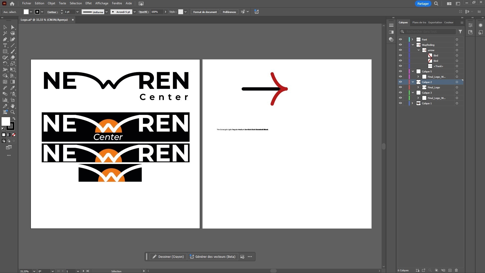
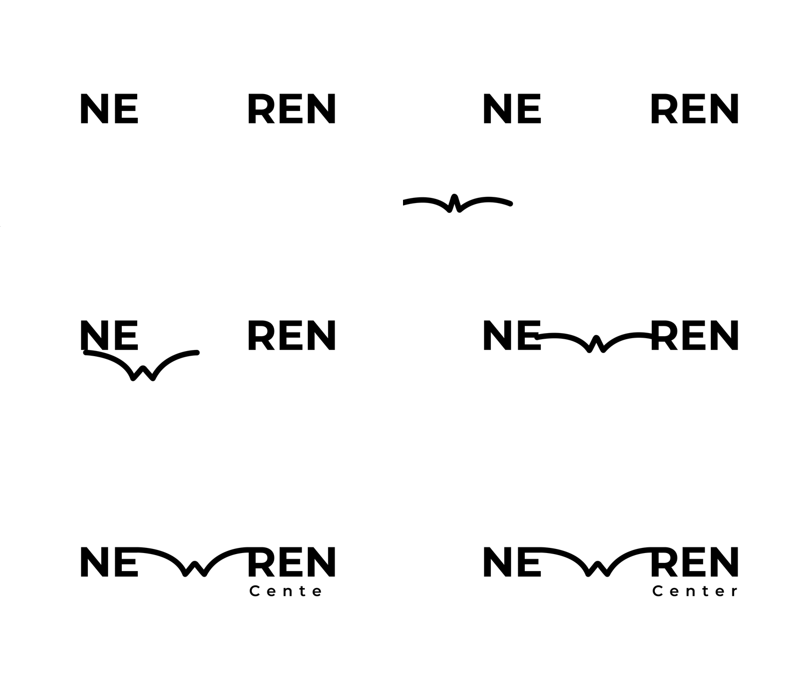
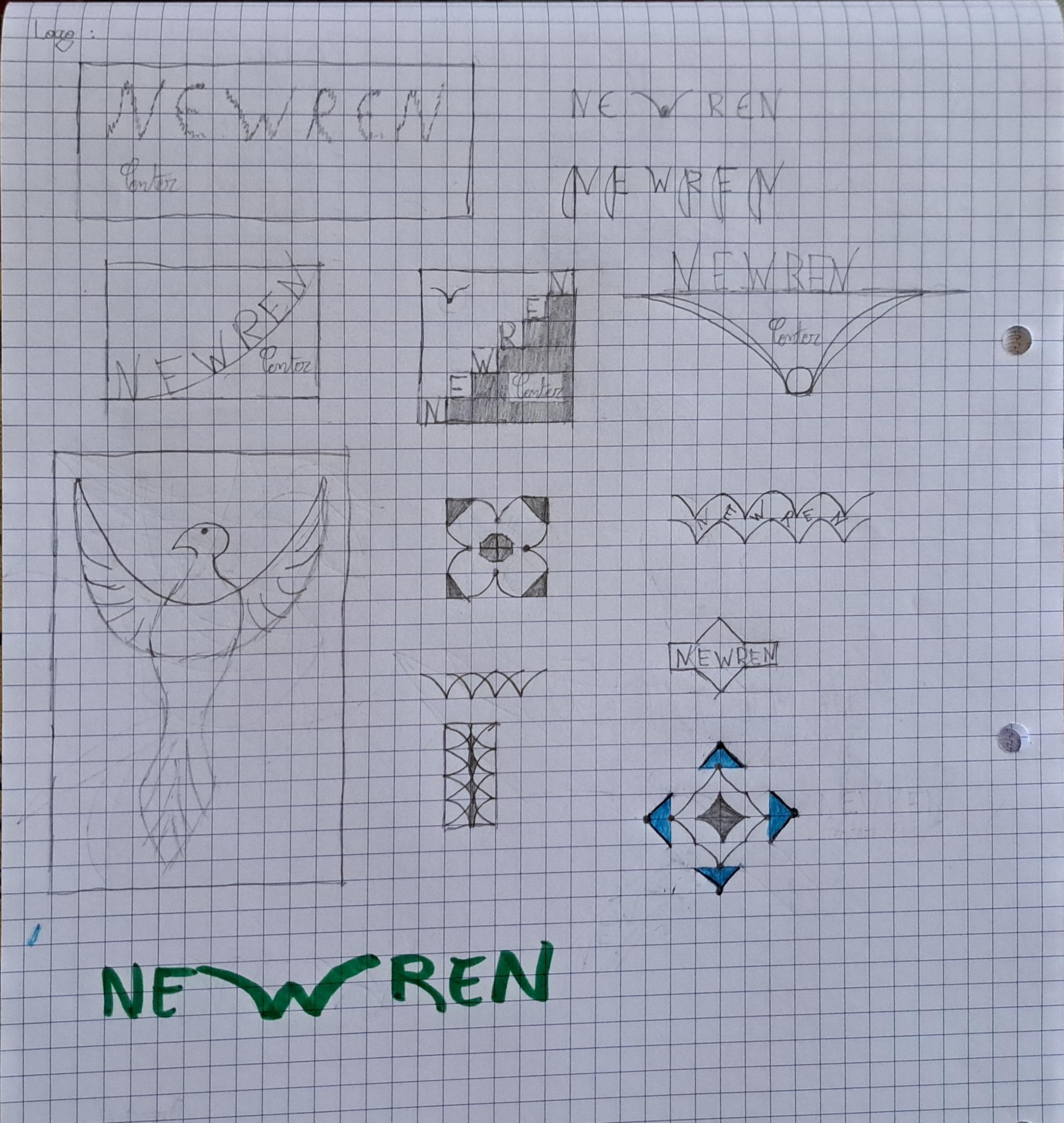
My art center is dedicated to supporting young talents so that they can stand on their own two feet later on, which is why I chose a bird as the symbol for my logo. I represented it with its wings only, replacing the “W” in “Newren.”
Learn more about the process
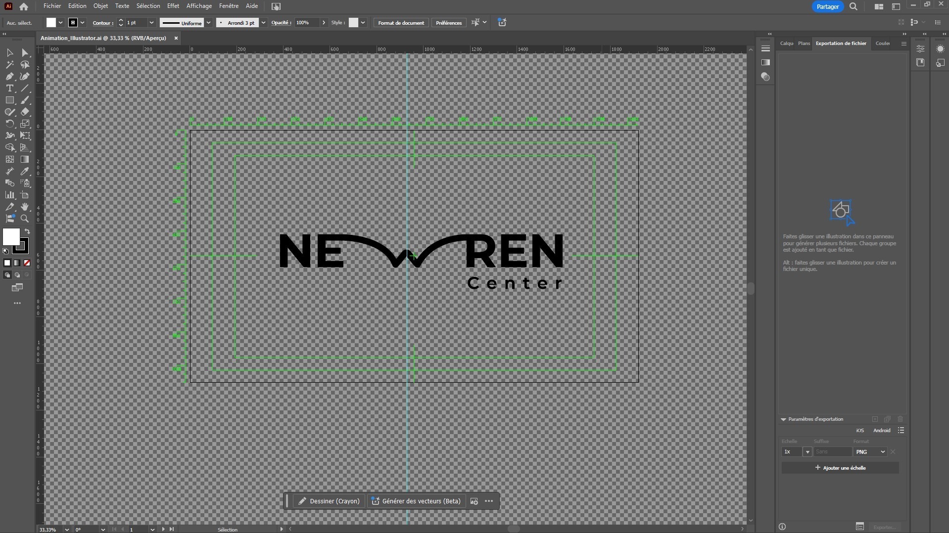
I created this logo with Adobe Illustrator software, selecting the “Montserrat, Bold” typeface to give it a clean and modern look. For the bird-like shape, I first traced one half, then duplicated it using the “mirror” function to ensure perfect symmetry. Once finished, I used the “pathfinder” tool to merge both shapes.
Graphic Universe
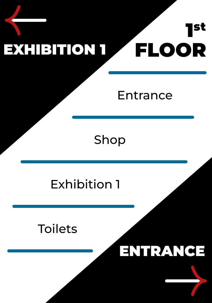
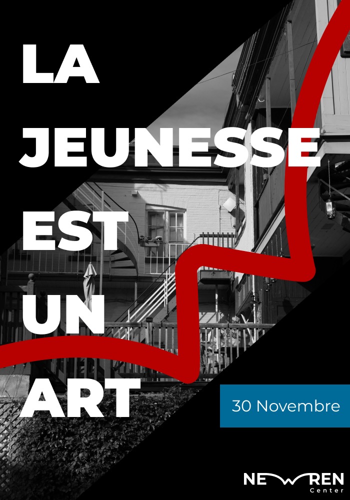
I kept the two primary colors and the typography of my logo to maintain consistency in my graphic universe. Two brighter colors were added to create contrast and make the whole design more dynamic. The red color emphasizes the dynamic and youthful aspect, while the blue evokes the sky, a symbol of freedom but also the world of birds.
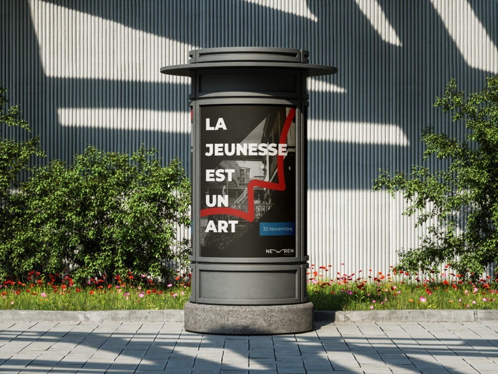
For the advertising poster, I chose to use a famous quote by Oscar Wilde: “Youth is an art.” This choice naturally aligns with the primary mission of my art center, which is to help young artists make a name for themselves. The name Oscar Wilde also helps to give the public confidence, but also to make it immediately clear that this is a center dedicated to the arts of all kinds.
Animation
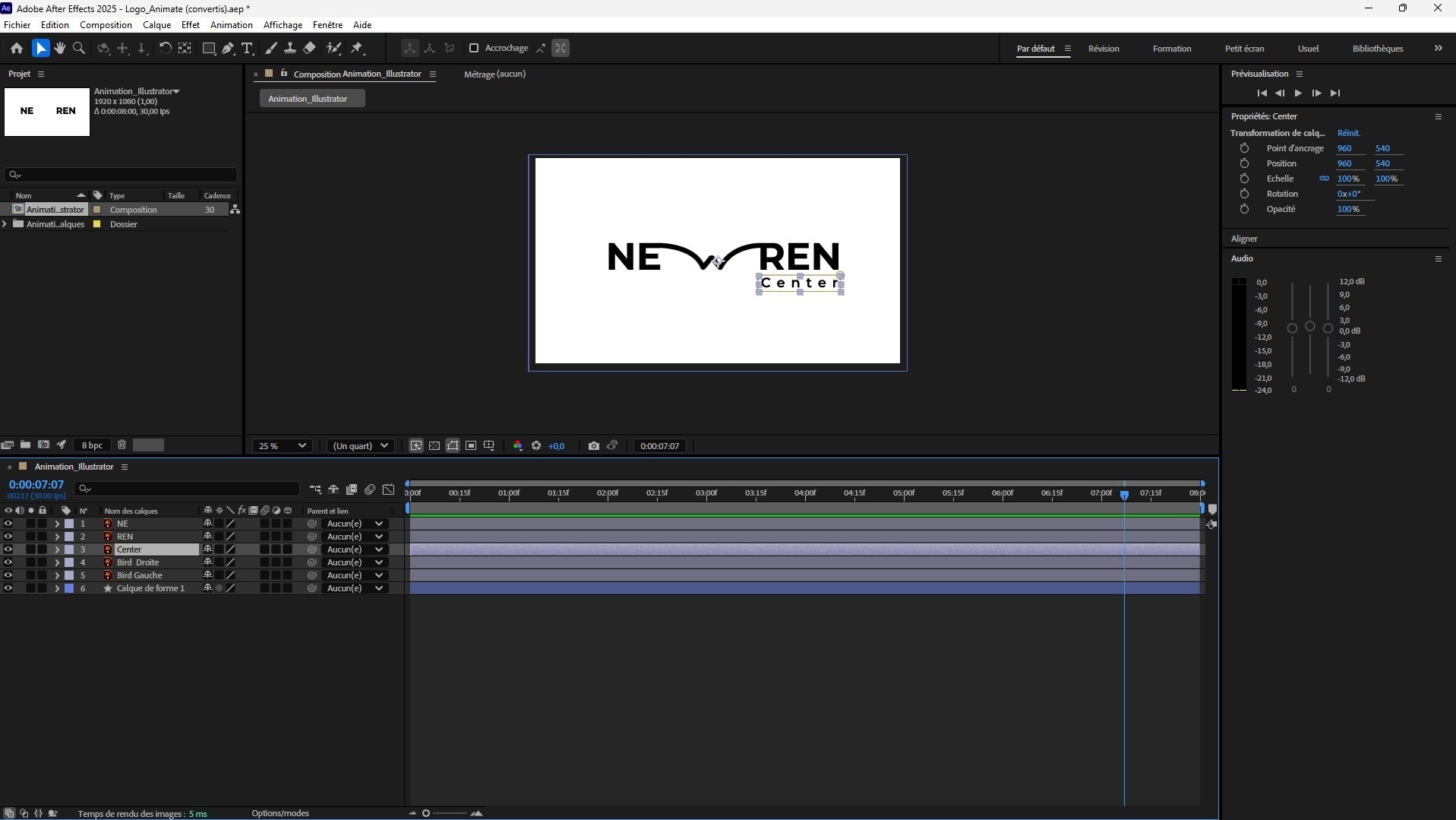
As the main shape of my logo is a bird, it was essential for me that it should move in the same way as the animal. So I imagined what the flapping of a bird’s wings would look like in animation.
